Tech Crypto Web Design & Landing Page
Industry
Crypto, Blockchain, Web3
Client
Hybrid Technologies
Service
Web Design, Landing Page Design, UI Design
Date
Figma, Framer
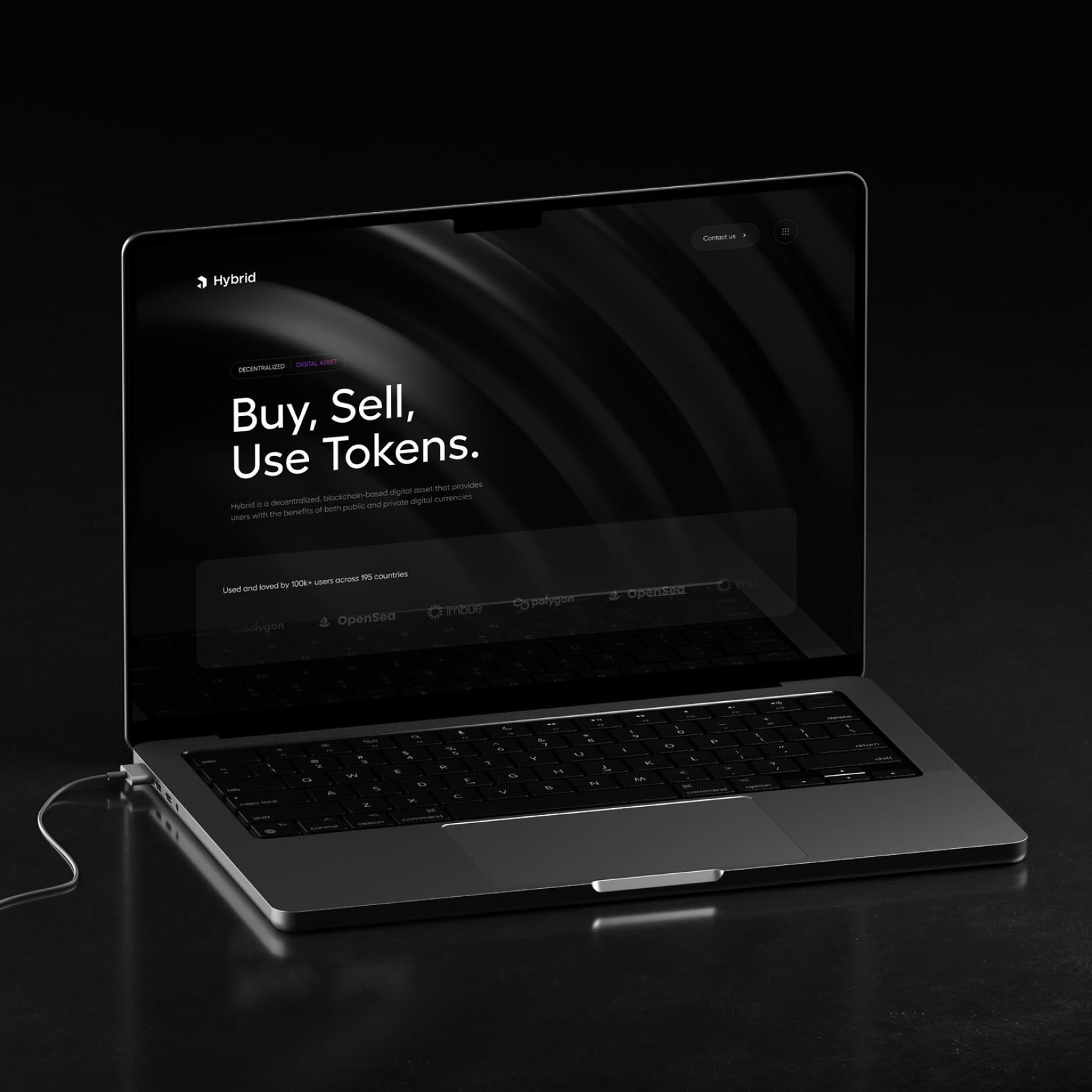
Hybrid Technologies had 100k+ users across 195 countries and a site that didn't match that scale. I designed and built a full dark-mode marketing site in Framer for their decentralized digital asset platform, structuring each section around a specific question a potential user might have before signing up. The result is a site that works for crypto-native visitors and those new to the space equally, with a clear path to action on every scroll.

Hybrid had a product with 100k+ users across 195 countries and a site that didn't reflect that scale. The platform is a decentralized digital asset that combines the benefits of public and private currencies. The brief was a full marketing site redesign: dark, premium, and built to communicate trust at first glance.
The Request
Hybrid Technologies came in with real traction and a site that didn't match it. The product had 100k+ users, 195 countries, integrations with Polygon, OpenSea, and Imbue. What it needed was a site that felt as serious as the product.
The ask: design and build a full marketing site in Framer from scratch. Something that would communicate credibility, explain what Hybrid is, and convert visitors who were new to decentralized finance and those who already knew the space. Every section needed a clear purpose.
Crypto Web Design Blockchain UI Design Web3 Landing Page Design Fintech Design Figma Framer Dark Mode Web Design Decentralized Finance
The Process
I settled on the design direction early: full dark background throughout. Dark, editorial interfaces are common in the crypto space, and Hybrid's product had the substance to back it up.
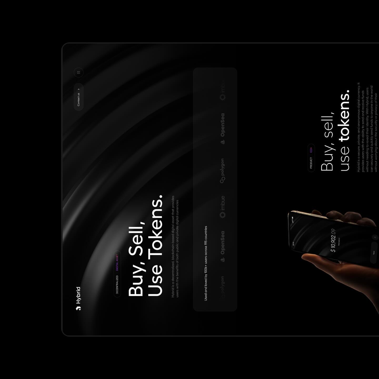
The hero leads with three words: "Buy, Sell, Use Tokens." Direct and immediately clear about what the product does. A short subheading handles the detail. The partner bar underneath (Polygon, OpenSea, Imbue) builds trust without taking up much space.
Each section below it has a clear job:
The mobile app section shows the product in someone's hand with a live balance on screen. It makes the product easy to picture using.
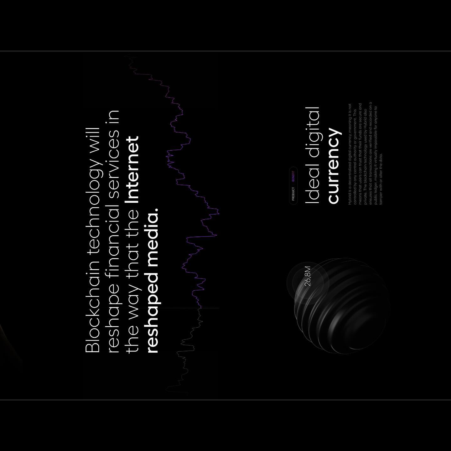
The blockchain quote section pairs a large editorial statement with a price chart. It places Hybrid in a bigger story about where finance is going.
The "Ideal digital currency" section explains the product's core benefit in plain terms: decentralized, secure, private, tamper-proof.
The founders section uses video testimonials to put human faces on a technical product.
The "Join the community" section closes on a single CTA.
Purple appears sparingly as an accent on tags and key text. It gives the dark design a focal point without competing with the content. The whole site was built and published directly in Framer, so there was no handoff delay between design and live.

The Outcome
The delivered work included:
Full marketing website, designed and built in Framer and ready to publish
Hero, feature sections, social proof section, and community CTA
Mobile app integration mockup
Footer with legal pages and social links
The site gave Hybrid a presence that matched the product. Each section moves the visitor closer to understanding what Hybrid is and trusting it enough to act. The dark editorial aesthetic places Hybrid clearly at the serious end of the crypto market.

Looking to start a project or you need consultation first? Feel free to contact me.