Fintech Brand Identity, UI/UX & Web Design
Industry
Fintech, Crypto, Payments
Client
Slipery Moneys
Service
Brand Identity, UI/UX Design, Dashboard Design, Landing Page Design
Date
Figma, Adobe Illustrator, Adobe Photoshop
Slipery Moneys came in with a working payment platform and nothing visual to go with it. I built the brand from scratch, designed a multi-section marketing site, and created a merchant dashboard for desktop and tablet. The product accepts BTC, Ethereum, Solana, credit cards, ACH, and debit cards in one place, so the design had to make that feel simple and trustworthy. The delivered work covered the full brand system, a production-ready landing page, a merchant dashboard, and a customer management interface.

Slipery Moneys had a working payment platform and nothing visual to go with it. The product lets merchants accept BTC, Ethereum, Solana, credit cards, ACH, and debit cards in one place. The brief covered everything: build the brand from zero, design the marketing site, and deliver a merchant dashboard ready for developer handoff across desktop and tablet.
The Request
Slipery Moneys came in with a product and a name. No logo. No brand system. No marketing page. The platform handled more payment types than most on the market, but there was nothing to show for it visually.
The full ask: build the brand from scratch, design a marketing site that explains what the product does and why it's worth using, and create a merchant dashboard built for real daily use. Desktop and tablet. Developer handoff included from the start.
Brand Identity Fintech Design UI/UX Design Dashboard Design Figma Web Design Landing Page Design Crypto Payments Merchant Dashboard
The Process
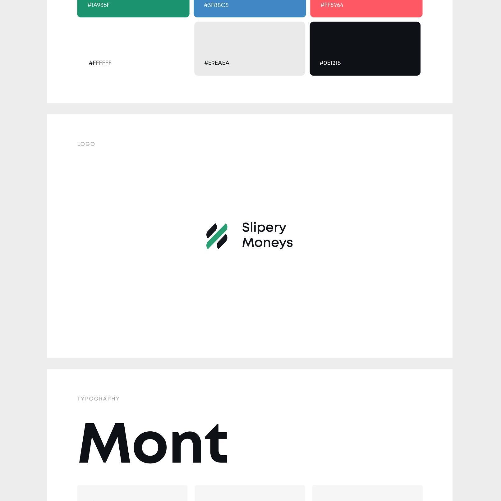
The brand came first. I built the color system around clarity and trust: a deep green for primary actions, a clean blue for structural UI elements, and a coral red for alerts and data flags. The dark navy on the dashboard creates contrast that keeps the interface easy to read in long sessions. I chose Mont for typography: modern, clean, and readable at any size.
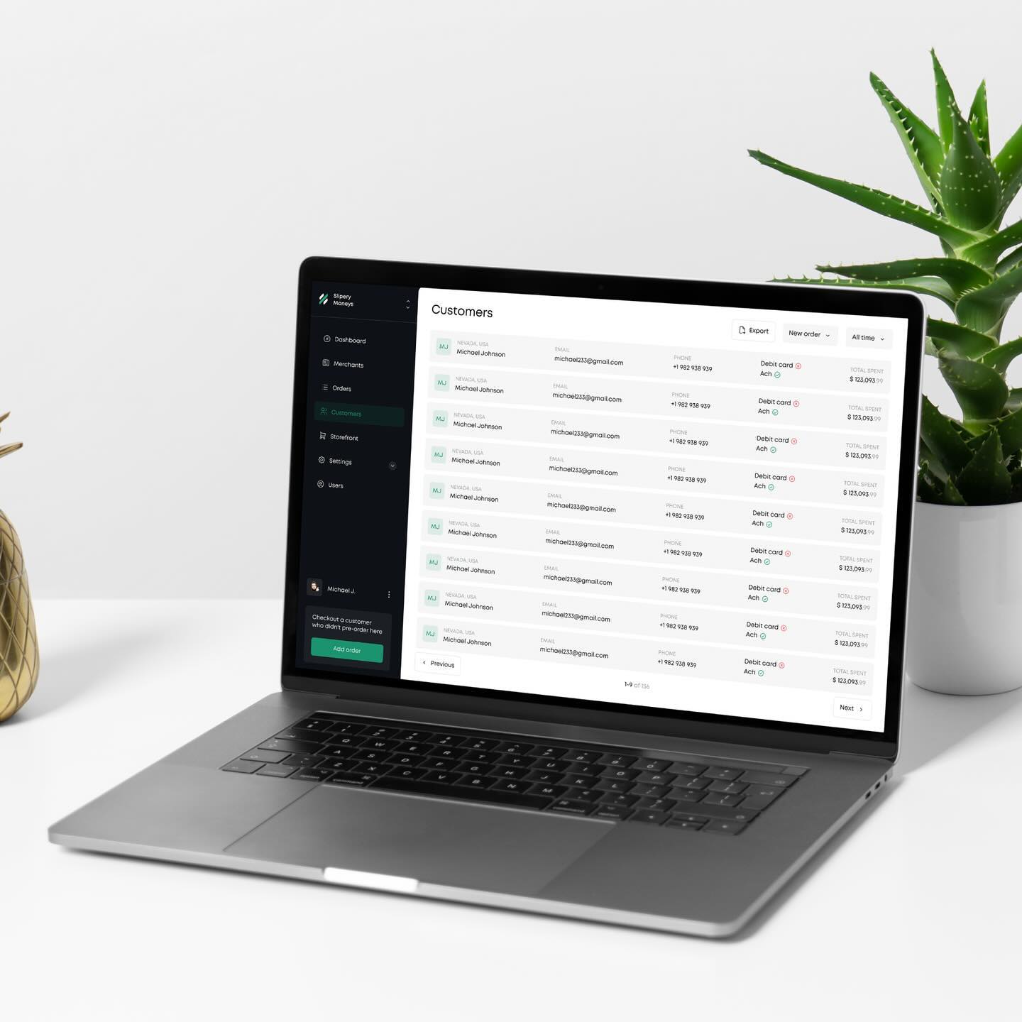
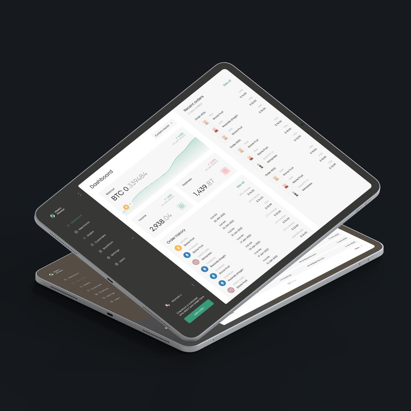
For the dashboard, the main goal was speed. Merchants need to see balance, income, and expenses fast. The top section surfaces all three at a glance. Order history and recent orders use a flat list layout. Data you can act on right away, no charts or tooltips to decode first. The customer management page follows the same logic: one row per customer, all key info visible, no buried menus.
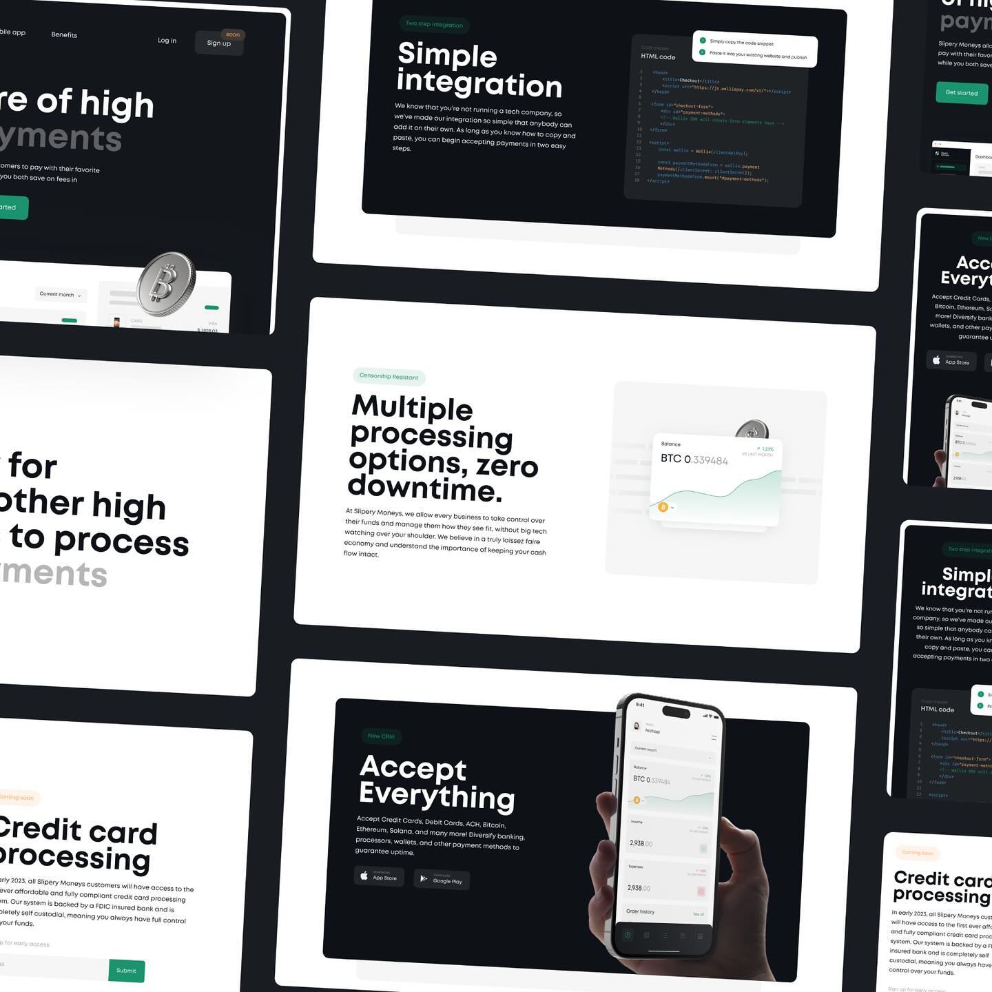
The marketing site had a different job. I structured each section around a real question a merchant might ask before signing up:
"Is this hard to set up?" A two-step code integration. Copy, paste, done. No technical background needed.
"What happens if it goes down?" Multiple processors run in parallel, so downtime is zero.
"Will it accept what my customers want to pay with?" Credit cards, debit cards, ACH, Bitcoin, Ethereum, Solana, and more.
The dark hero and the clean white content sections below it create clear visual breaks as you scroll through the page.
The Outcome
The delivered work included:
Full brand system: logo, color palette, typography, and usage guidelines
Multi-section marketing landing page, production-ready for developer handoff
Merchant dashboard for desktop and tablet
Customer management interface
The brand gave the product a visual identity that works across web, app, and marketing. The dashboard gave developers a finished, detailed reference to build from. The marketing site was built to convert merchants who already know their payment problem, and to inform those who are still deciding what they need.

Looking to start a project or you need consultation first? Feel free to contact me.