Modern SaaS Logo Design
Industry
Tech, Workforce Management, SaaS
Client
SuperSchedule
Service
Logo Design, Branding, Color & Typography
Date
Figma, Illustrator, Photoshop
A brand built from zero in a market where every competitor defaulted to the same cold enterprise look. The result: a deep blue and orange system, a grid-based logo, WCAG AA-compliant color palette, dual-typeface scale, and a complete brand guidelines PDF. The client said it was the direction they had been trying to articulate for months.

The Request
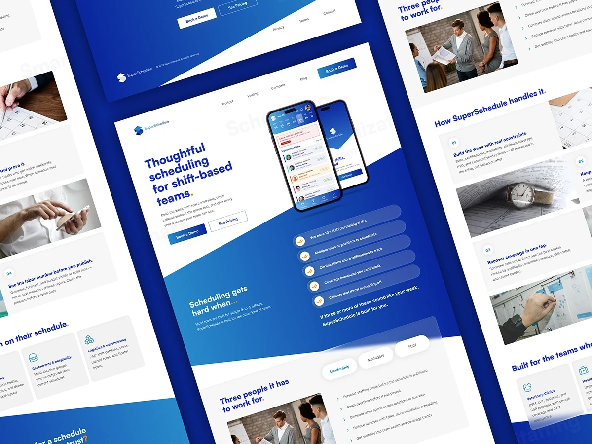
SuperSchedule needed a brand built from zero: logo system, color palette, type specs, brand guidelines, a 1440px homepage, and two iOS screens for App Store submission. The product competed directly against When I Work, 7shifts, and Sling, all of which defaulted to cold enterprise aesthetics. The brief called for something reliable and approachable without tipping into consumer-app softness, a narrow target that required a clear point of view, not just execution.

The Process
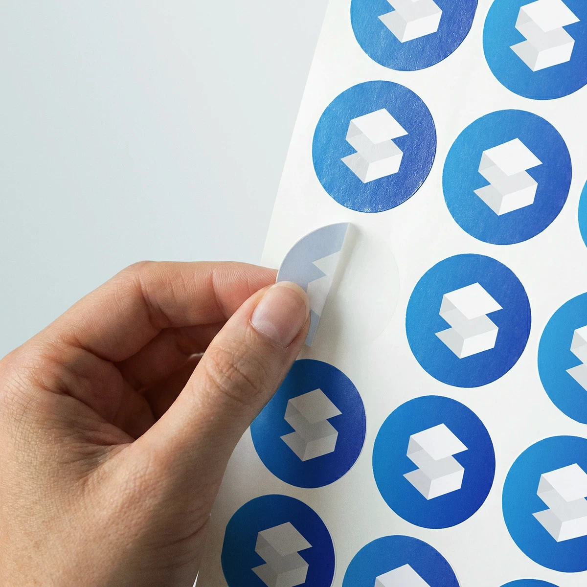
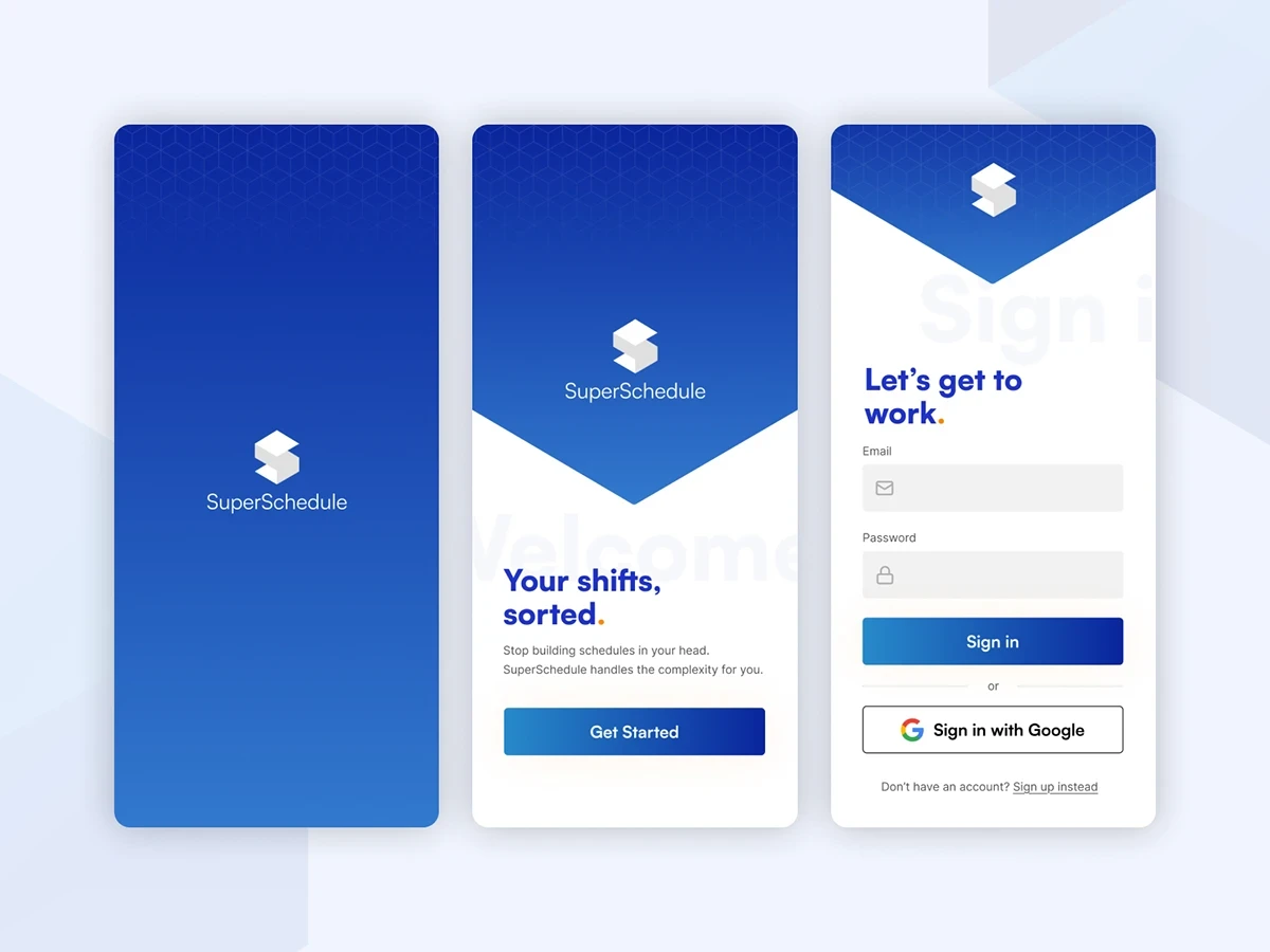
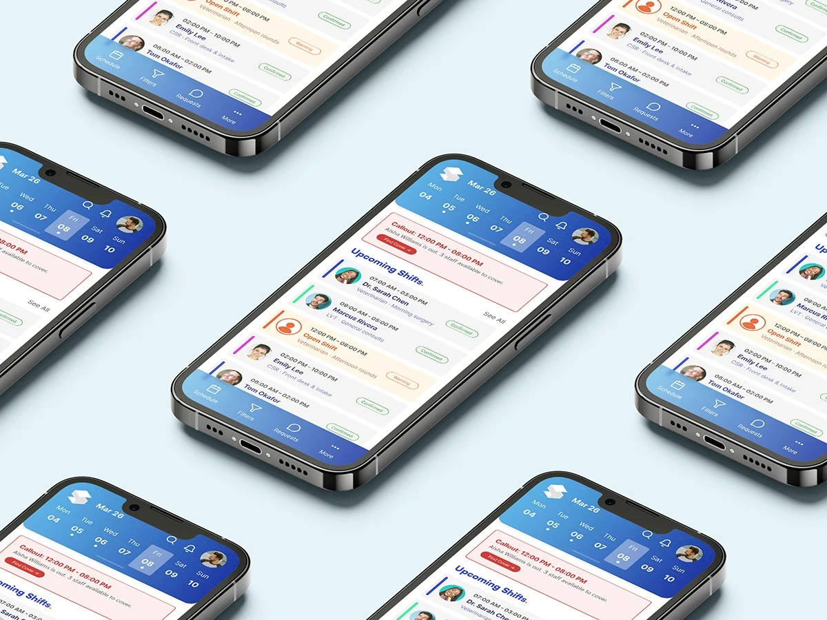
A competitive audit confirmed the category gap: no one was owning the space between enterprise utility and consumer warmth. Deep blue (#1f32c4) became the primary, structural, trustworthy, and legible at scale, with orange (#fc8a08) locked in as an action accent. The logo was built on a 2×2 grid motif referencing the shift schedule itself, scaling cleanly from full lockup to favicon. iOS screens were designed across three dashboard variations (staff view, dark-mode manager view, and timeline grid) giving the client full coverage for the App Store submission and a clear picture of how the system behaves across user types.
The Outcome
The delivered system covered every logo variation and format, a full WCAG AA-compliant color palette with approved pairings documented, a dual-typeface scale across Satoshi and Inter for web and mobile contexts, and a complete brand guidelines PDF. The orange and blue pairing gave SuperSchedule a recognizable visual signature distinct from every direct competitor in the category. The client selected option 4 in round two and described the result as the direction they had been trying to articulate for months.

Looking to start a project or you need consultation first? Feel free to contact me.