Why Most Pitch Decks Fail Before the Meeting Starts
DESIGN

You got the intro. A warm referral, a cold email that actually got a reply. The investor wants to see your deck. And then... silence.
Most pitch decks fail because they make the investor work too hard. Investors spend 2-3 minutes reviewing a deck before deciding to take a meeting. If the slides are cluttered, the story doesn't flow, or it looks like a free template, most move on before you get in the room.
I've designed decks through Series A, B, C, and D rounds. The problem I see at every stage is the same one. It's not the market slide. It's not the financials. The deck itself isn't communicating clearly enough, and the investor isn't going to work to figure out what you mean.
Here's what's actually going wrong.
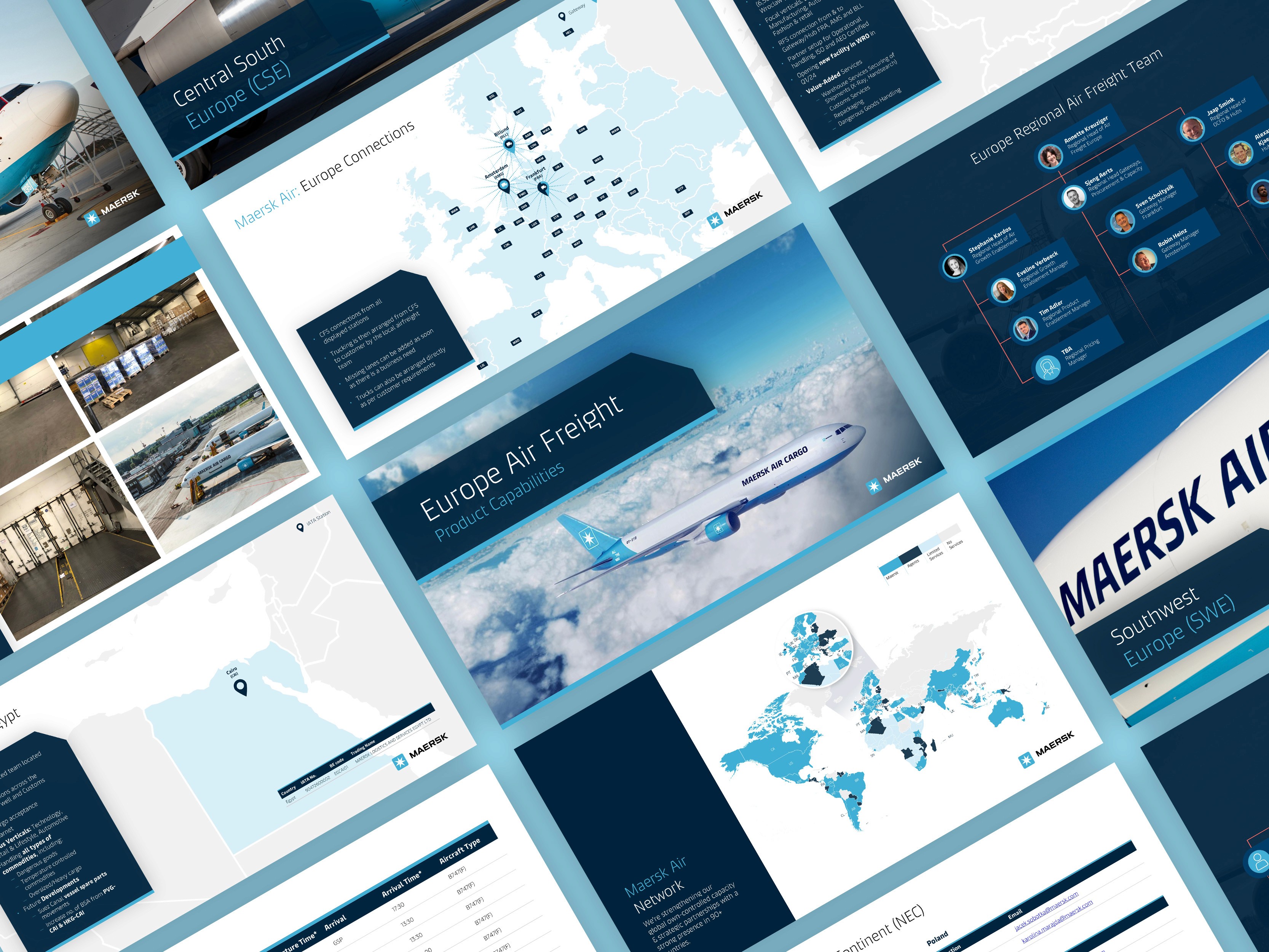
Why do investors decide in the first two slides?
They've seen hundreds of decks. They've trained themselves to read signals fast. Your first two slides tell them to keep going or stop.
Slide one should answer three things immediately: what does this company do, who is it for, why now. If an investor has to read it twice to understand what you do, that's the decision made.
I've seen founders spend weeks perfecting their financial model slide while the cover slide still says something like "AI-powered solutions for modern businesses." That cover slide is costing them meetings they don't even know they're losing.
Why does slide order matter so much?
A pitch deck is a story. Every slide should answer the question the previous one raised.
Put your financial projections before you've established the problem and the numbers land in a vacuum. Put the market size before anyone understands what you're building and the TAM doesn't mean anything.
The decks that worked for Series C and D fundraising were the ones where each slide earned the next one. The investor was always one step ahead, wanting more. That's the feeling you're building toward.
Why is my pitch deck hard to read?
Bullet points. Long ones. Packed into a small font on a busy background.
Investors often review decks on a laptop in a hurry, sometimes sharing their screen with a partner. If they have to lean in to read a slide, you've lost the room already.
Things that actually help:
One idea per slide
20-30 words of text or less
Numbers need breathing room to land
The main point should be readable at a glance, not after three seconds of reading
Does design affect how investors see your company?
More than most founders expect. A lot more.
A generic or inconsistent deck sends a quiet signal about how the company runs. Investors are evaluating you and your team as much as the idea. How you present is evidence of how you think, how you communicate, how you'll show up to customers and partners.
I built a presentation system that three internal teams adopted. Deck production time dropped by 35%. The bigger change was subtler: everything that went out looked like it came from a real company with real standards. That matters in a fundraising meeting. People pick up on it even when they can't name exactly what they're noticing.
What should I fix first if my pitch deck isn't landing?
Start with the story. Then look at the design.
Read your slides out loud, start to finish. Does each one follow from the last?
Cut any slide that doesn't move the story forward
One clear point per slide, nothing more
Make the cover and problem slides as simple as possible
Then check the visuals: consistent fonts, consistent colors, looks like one company made it
If you're not sure where the gaps are, that's the answer. A second pair of eyes finds them fast.
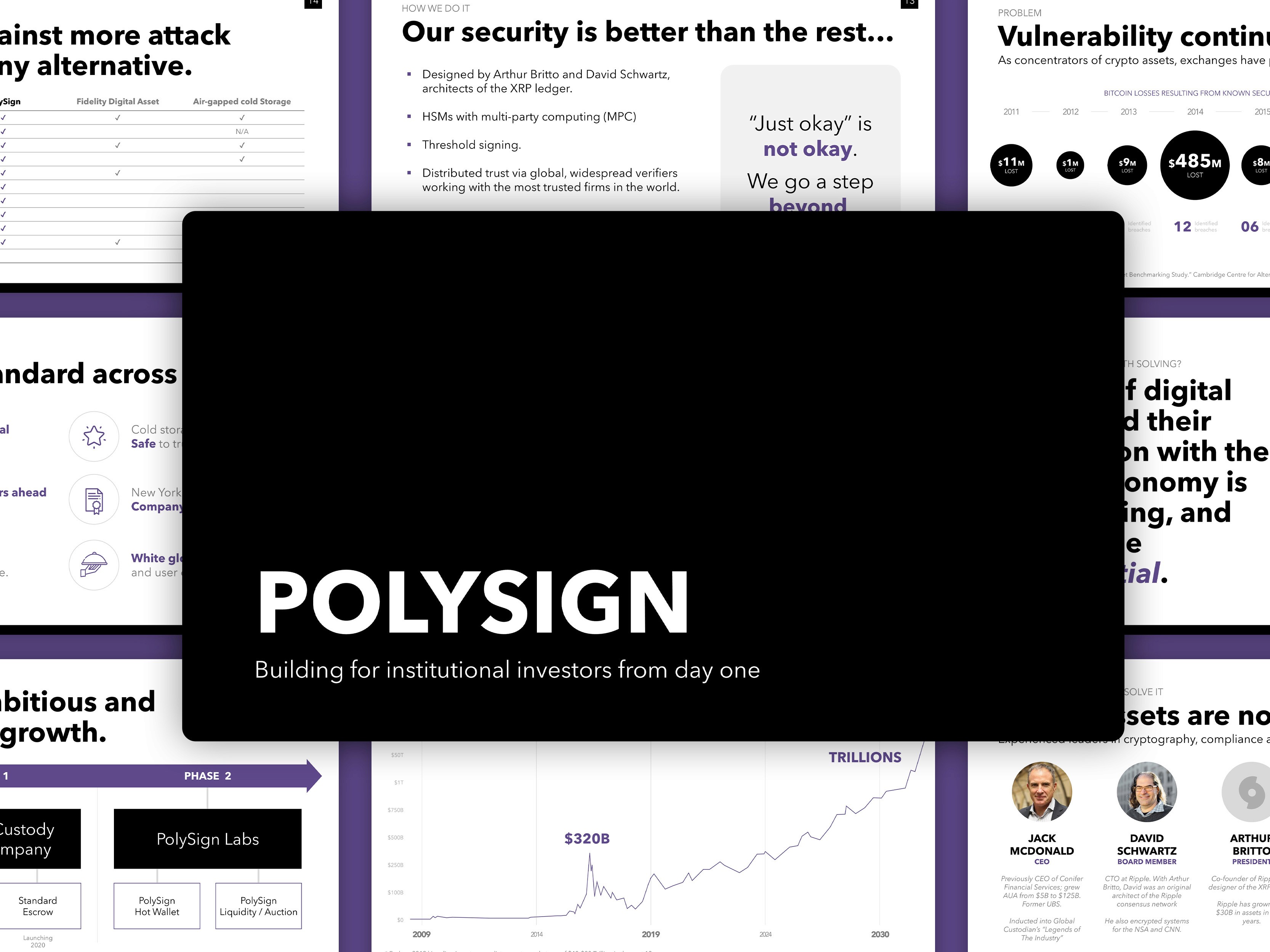
Frequently Asked Questions
How long should a pitch deck be? 10-15 slides. Longer than that makes it harder to follow the story. Clear and tight beats complete every time.
What slides does a pitch deck need? Cover, problem, solution, market size, business model, traction, team, and ask. That's the core. You can expand from there.
Does pitch deck design really matter? Yes. A poorly designed deck can undermine a strong pitch. It signals how seriously you take detail and communication, which investors read as a signal about how you run the company.
How many words should be on each slide? As few as possible. If you can say it with 10 words and a visual, do that.
Should I use a Figma template for my pitch deck? Templates are fine as a starting point. But investors have seen the same five free templates hundreds of times. A branded, custom deck stands out immediately.
What makes an investor deck different from a sales deck? A sales deck sells your product. An investor deck tells the story of your company and why it will become very large. Completely different structure, completely different emphasis.
How long do investors spend on a pitch deck? About 2-3 minutes in an initial review. That's why the first two slides carry everything.
———————————————————————————
If you're working on a deck and want a second pair of eyes, I'd love to help.
✉️ Email | 🌐 Portfolio | 🏀 Dribbble | 🤝 LinkedIn
Looking to start a project or you need consultation first? Feel free to contact me.