HatchPad is the new platform developed by HatchIT, a website that connects local engineers with startups and investors from the DC area.
They reached out wanting us to create their branding and website for their new platform from scratch.
HatchPad is the new platform developed by HatchIT, a website that connects local engineers with startups and investors from the DC area.
They reached out wanting us to create their branding and website for their new platform from scratch.
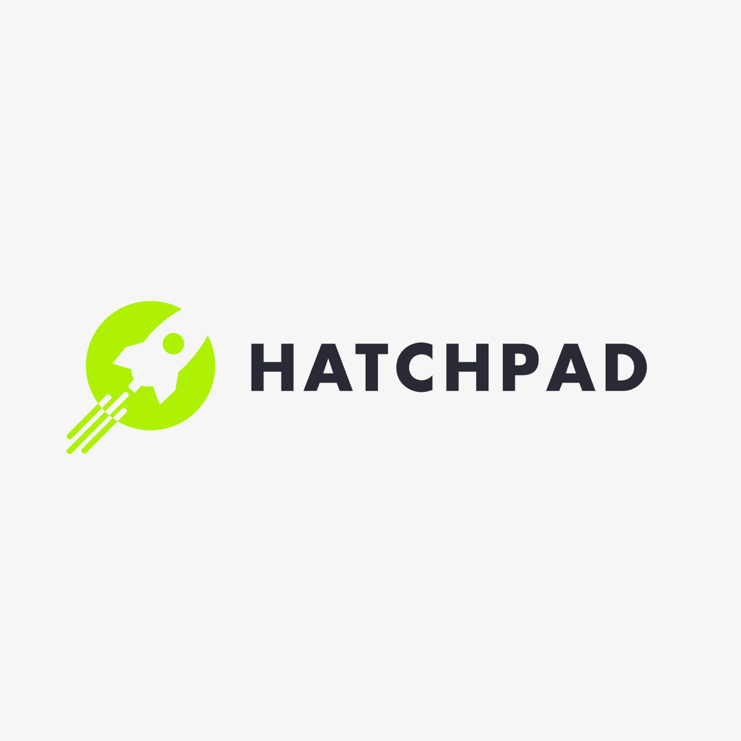
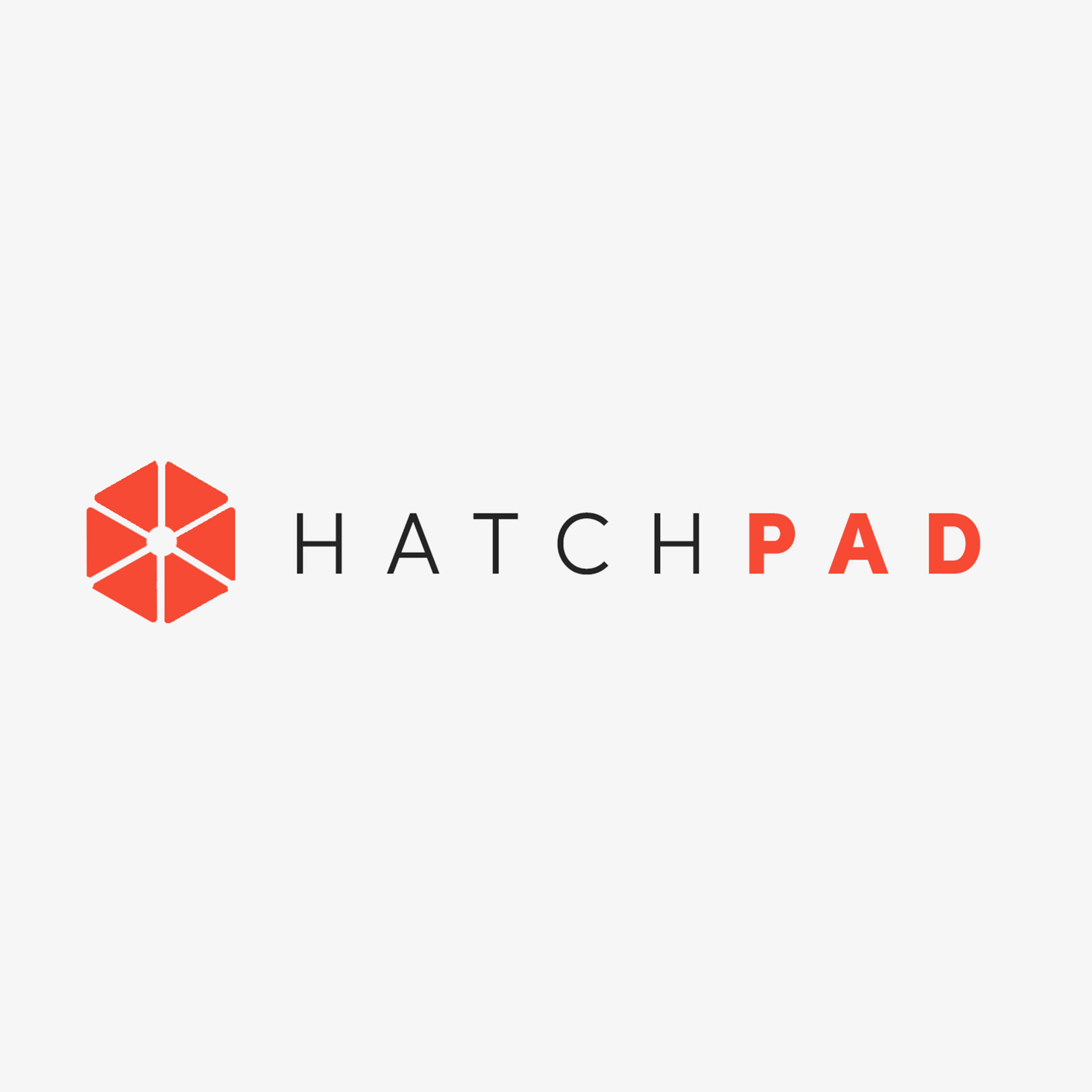
We started trying a few ideas for their logo, with different fonts and color palettes.
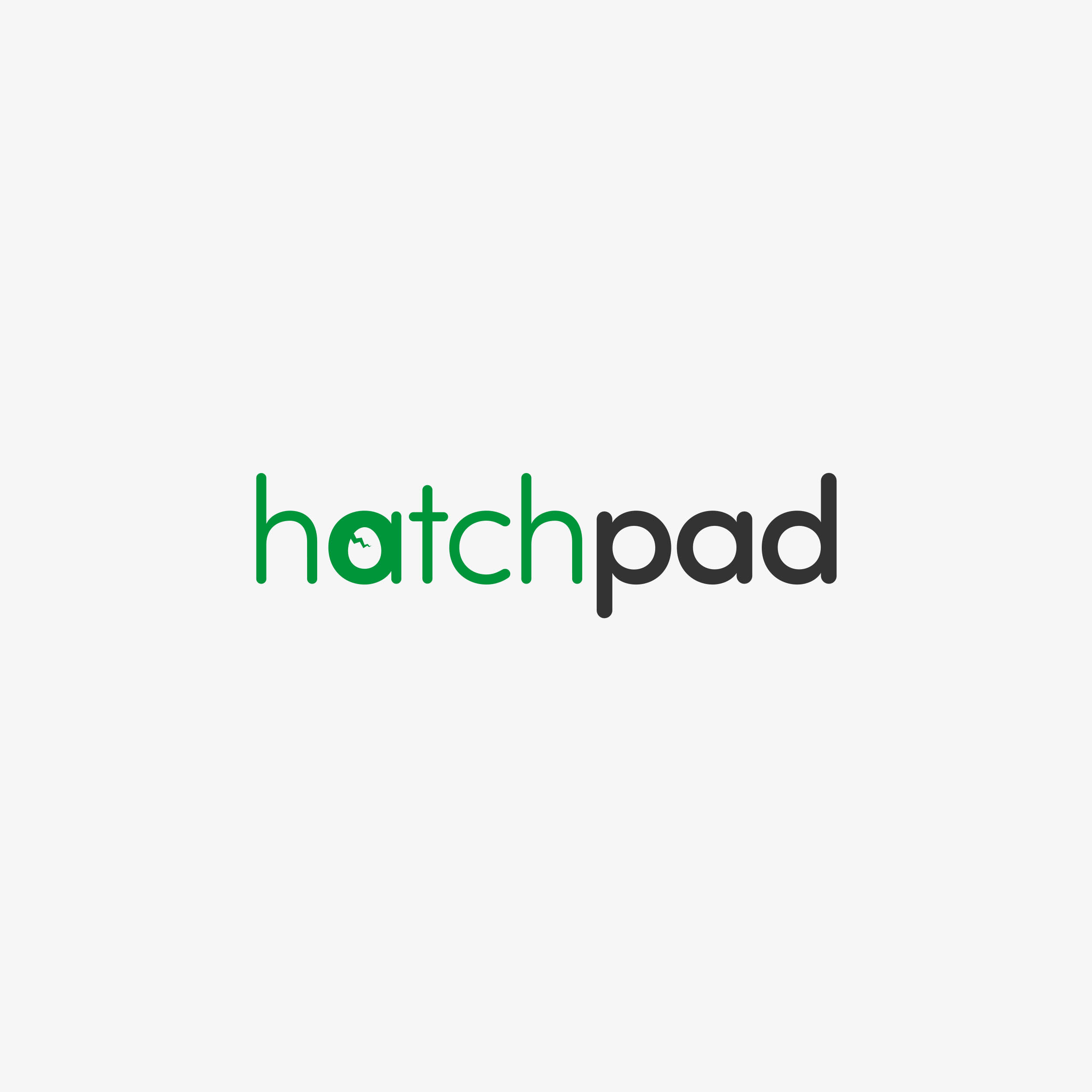
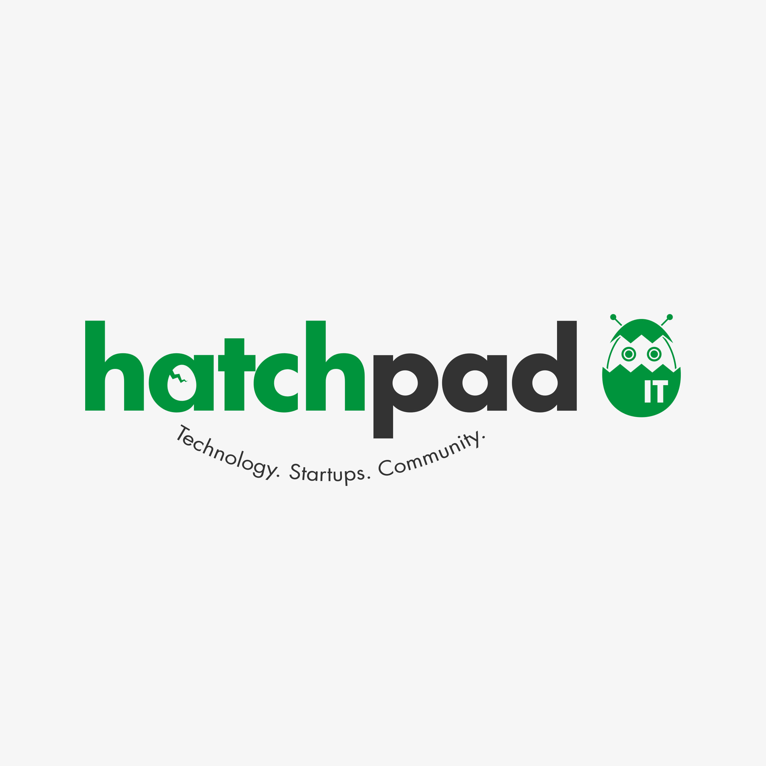
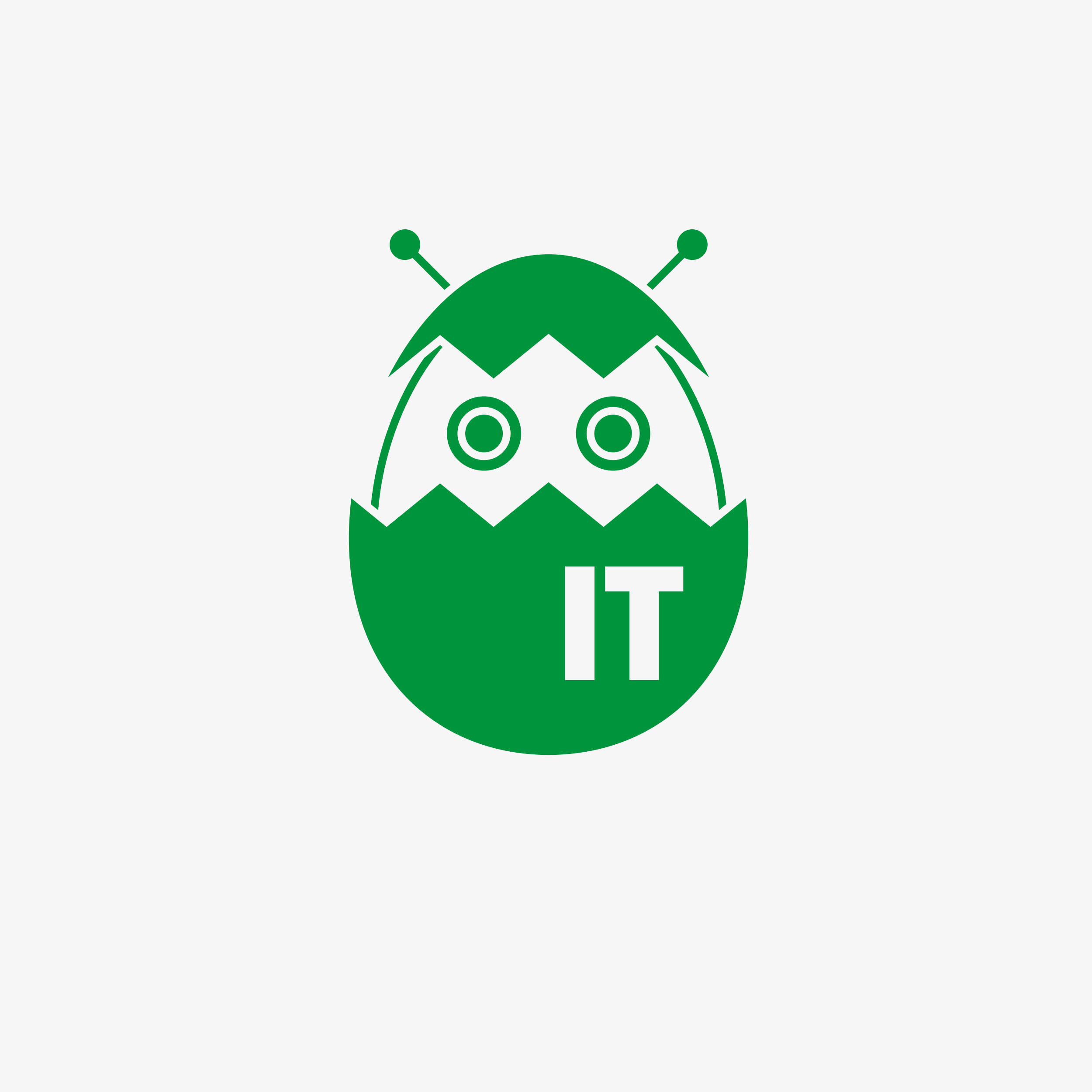
We finally decided on a design more similar to their current HatchIT branding, having the same mascot, font and color palette. The logo has a simple and distinguishable silhouette, with a modern but serious font choice appealing to their target demographic.
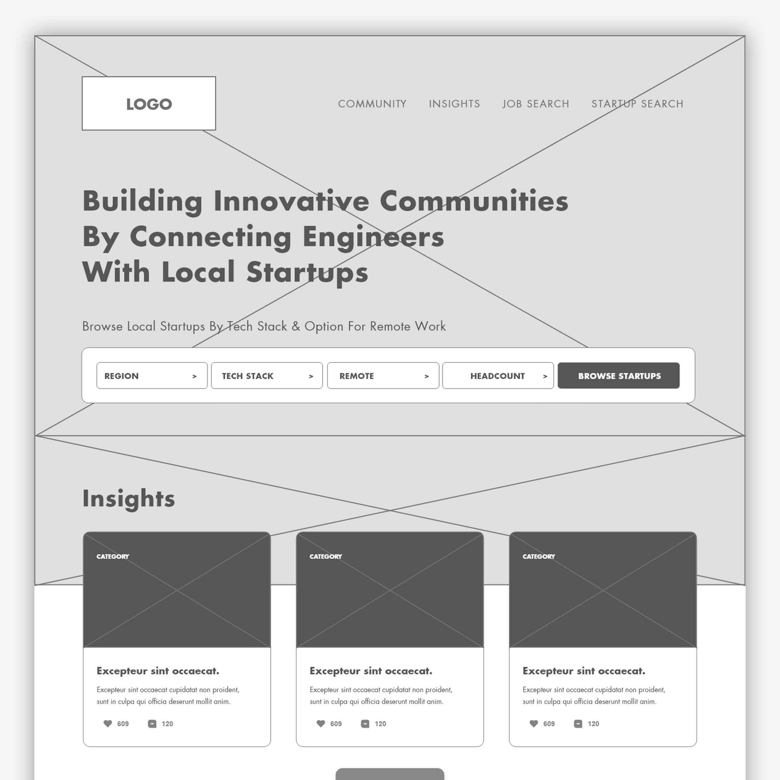
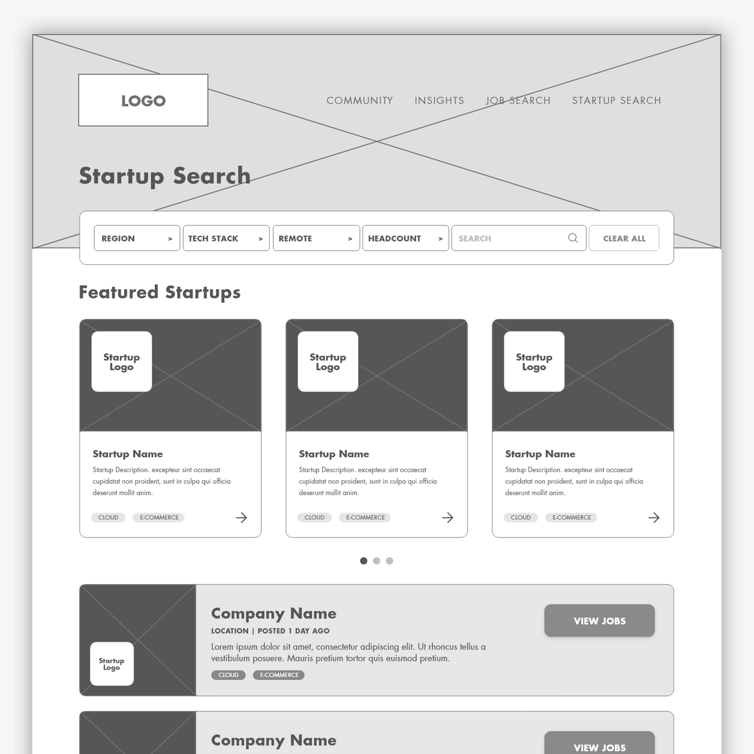
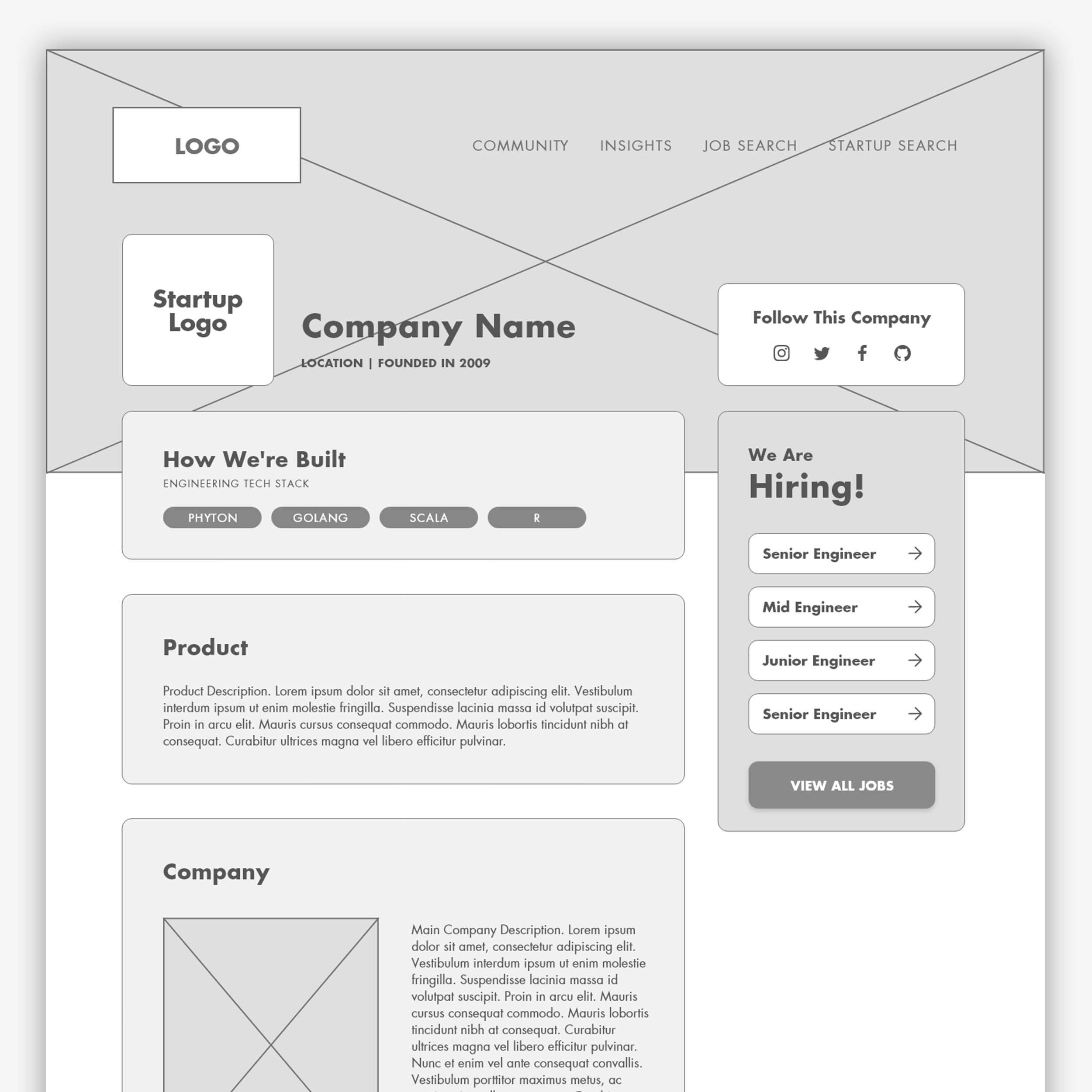
We wanted to have an straightforward and simple approach for the end user to search for jobs and startups. While also having in mind the community feeling they wanted to implement, so easy access to industry insights and events was critical.
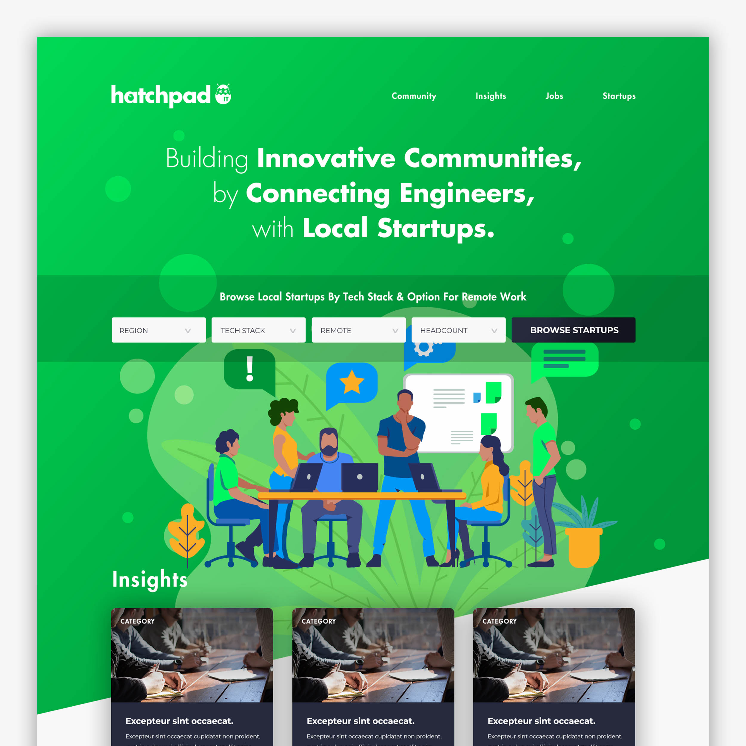
The final website was created with a heavy focus on imagery. We wanted a very casual, modern approach as they want to portray the image of a friendly community that wants to help connect startups and talent.
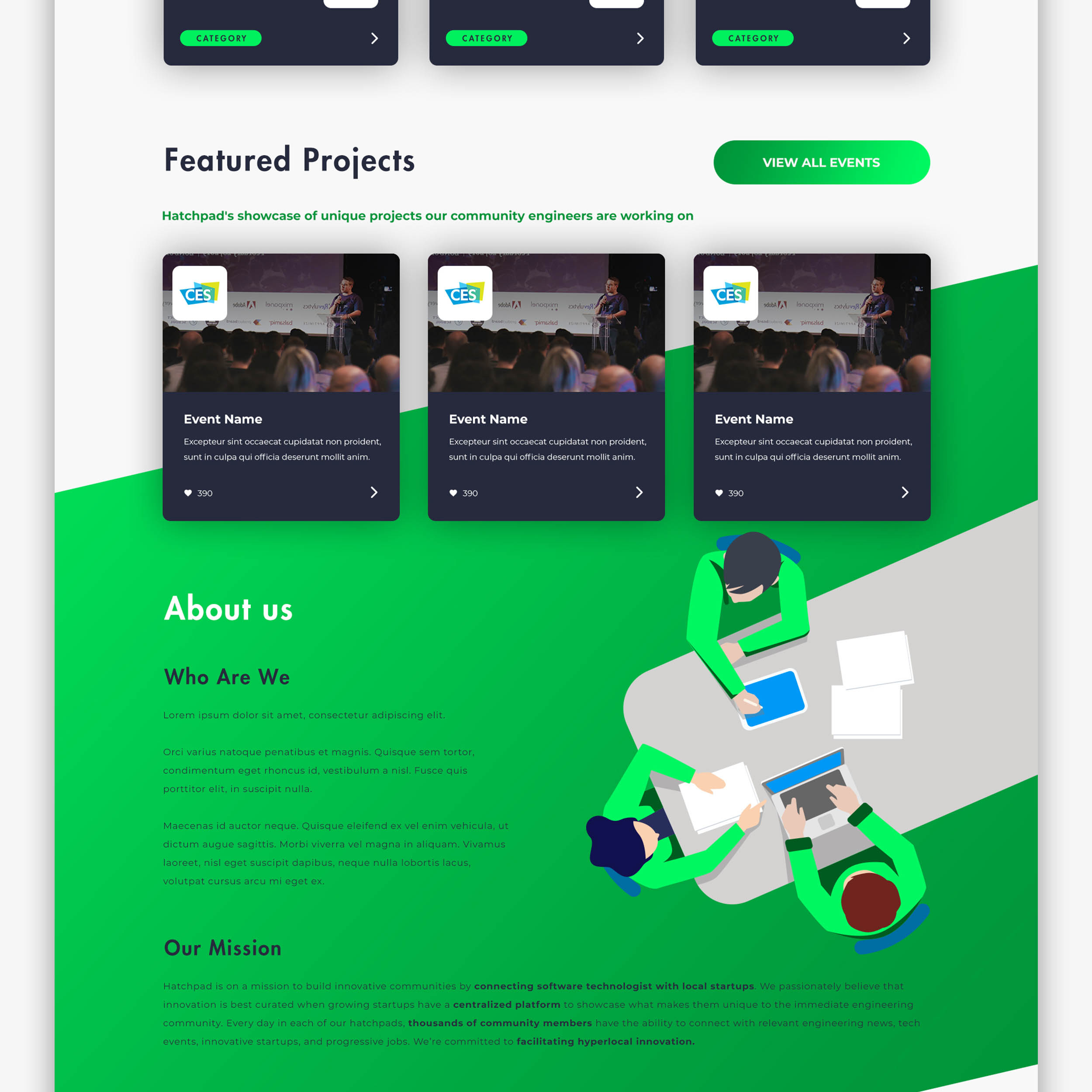
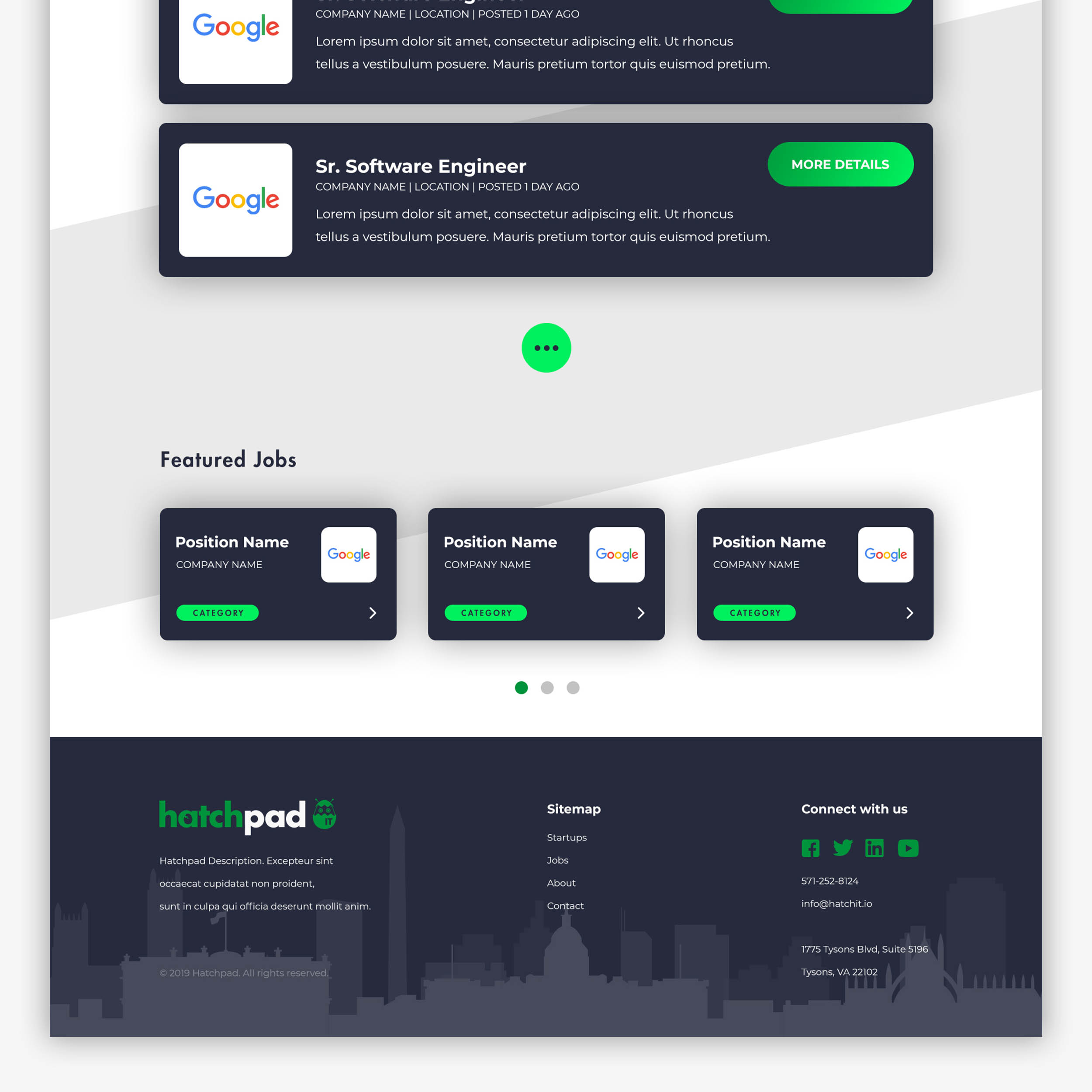
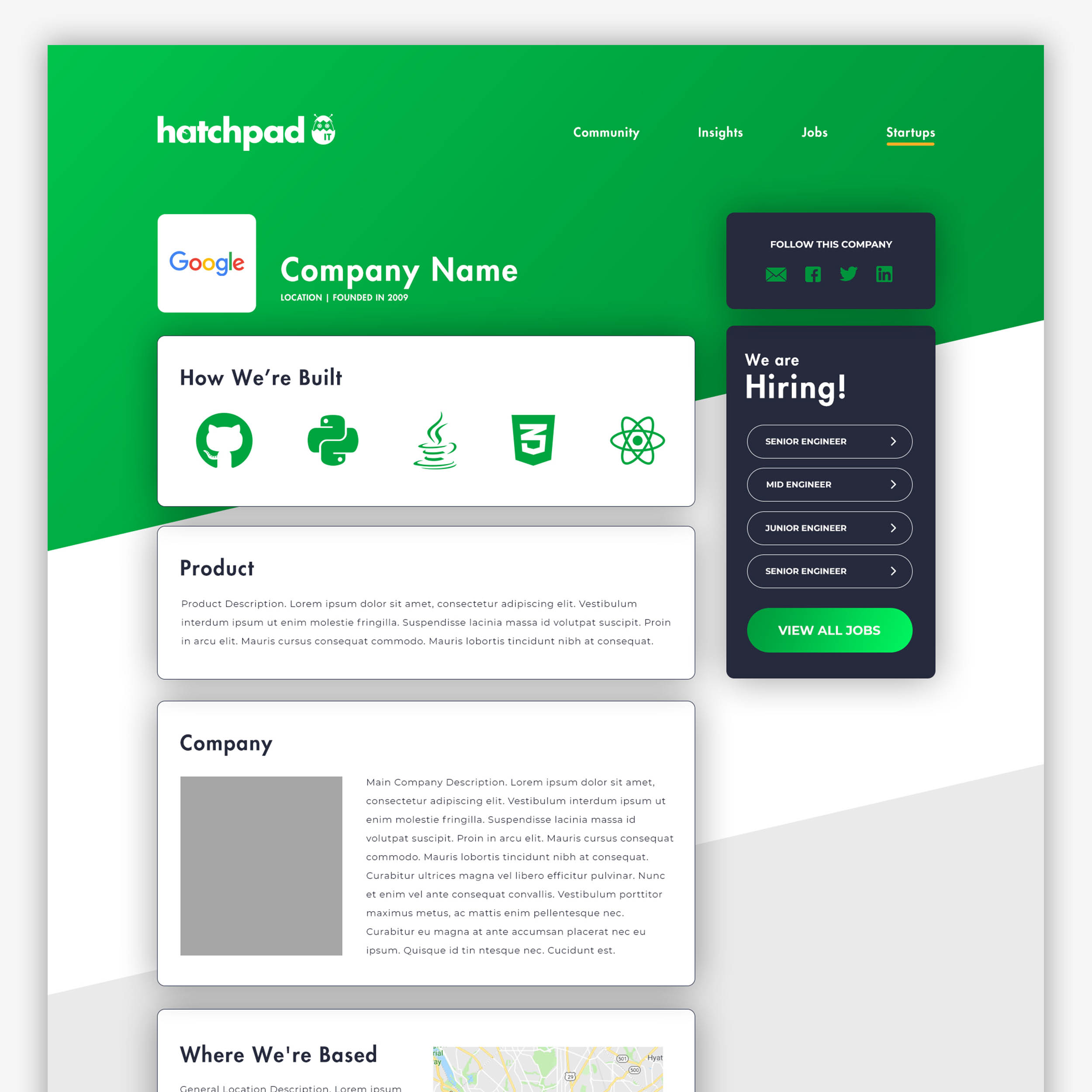
The colors chosen were taken from their original color palette but adding subtle differences to increase the contrast. I wanted to keep it simple, mostly using the two tones of dark blue and green, with some orange tones only used in illustrations for more of a dramatic impact.
or fill up this contact form